Elevating Sprinklr’s Thought Leadership with Forbes & LinkedIn

Interactive data storytelling showcasing global marketing influence
Introduction
Through its annual partnership with Forbes and LinkedIn, Sprinklr produces the interactive companion report to Forbes World’s Most Influential CMOs list, an annual look at the top marketing leaders shaping global brand influence. In 2021, I designed and launched Sprinklr’s first fully interactive companion report, shifting the experience from a static PDF to a digital-first format built in Ceros.

In 2022, I returned as the primary designer and built on that foundation. The concept focused on five distinct models of influence, drawn from Sprinklr’s AI-powered data. Working under a tight timeline, I translated that editorial framework into a layered, motion-driven design system that brought clarity and cohesion to a dense, multi-path content experience, ultimately helping generate new customer leads for the company.
View Full Interactive Report
My Role
I led visual and interaction design for the 2022 report, translating a complex narrative into a responsive, editorial-style experience that felt polished and intuitive. I handled visual direction, layout, animation, and interaction logic, all within the Ceros platform.

I collaborated with a cross-functional team that included our design director, another designer on the data visualizations, and content specialists such as data experts, writers, and editorial leads. Together, we aligned on the narrative, visuals, and data accuracy, while I was solely responsible for executing the design and building the report to deliver a cohesive, user-focused experience.
Mock up of report on different devices

Icon Design

For this report, icons weren’t just decorative — they were a way to translate dense, data-driven topics into visuals that could be understood instantly. After clarifying the five topics with the team, I designed icons that communicated each concept at a glance while staying consistent with Sprinklr’s established iconography style. Shown on the right are the original text descriptions and inspiration examples I gathered; on the left are my drafts as I refined imagery and tested approaches. I also collaborated with another designer to explore using chart shapes as icons, ultimately repurposing them as report dividers to visually separate sections.

Color Strategy

Each of the five models of influence was assigned its own color, drawn from Sprinklr’s extended palette. This strategic use of color made it easy for readers to differentiate models at a glance and reinforced recall throughout the report. Applying these colors consistently across icons, charts, and section dividers created a cohesive visual rhythm while adding energy to the dense content, making the experience more engaging and easier to navigate.
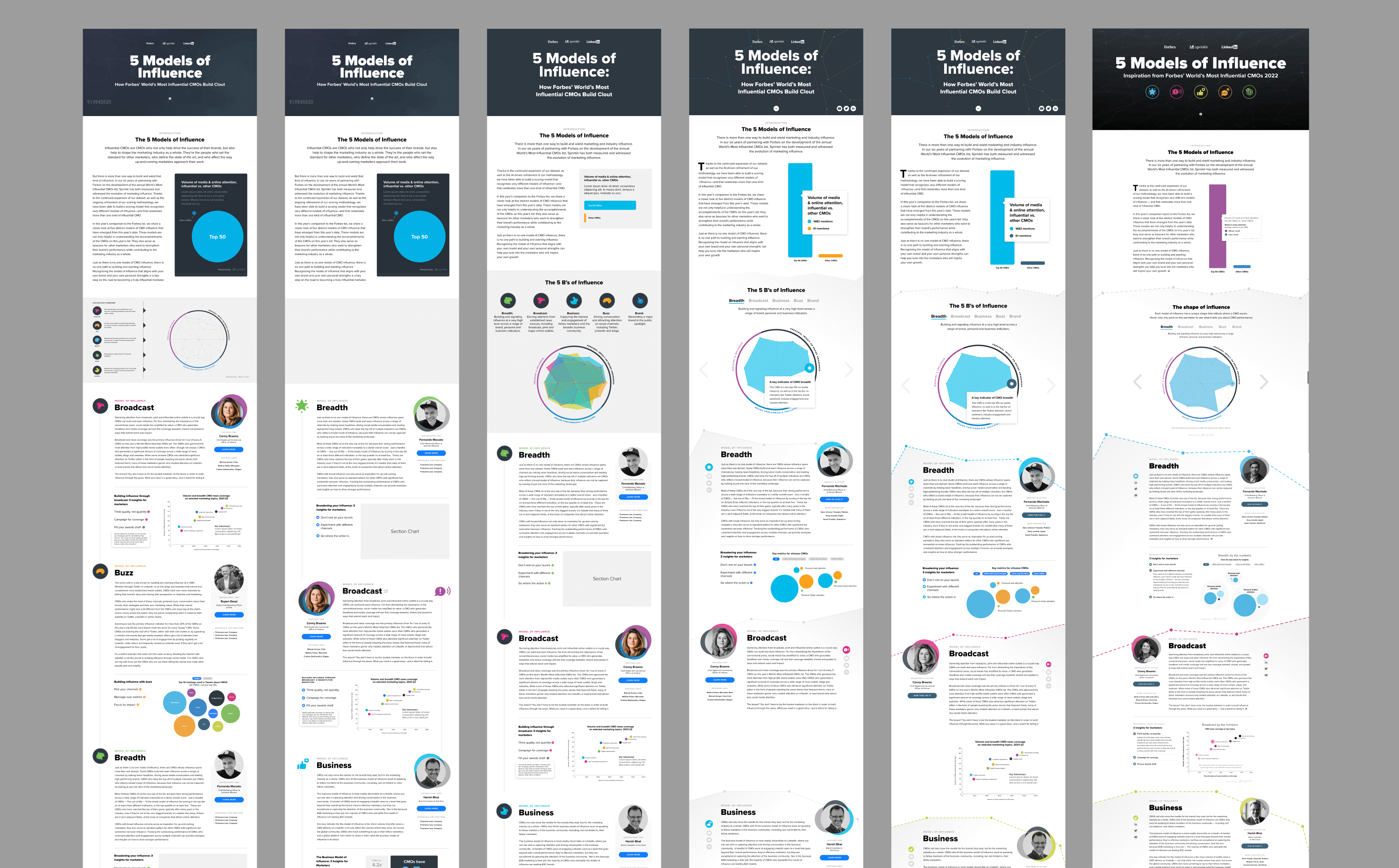
Early layout ideations in Figma, with the final production build in Ceros on the right.

Challenge

One of the biggest challenges in this project was constant context switching, made even more difficult by the short timeline. I had to think about layout, design, interaction, and how to fit all the text into a single viewport, while also ensuring the design encouraged users to scroll to the end without bouncing. On top of that, I moved between ideating in Figma and building in Ceros, which involved manually managing show/hide states for what felt like hundreds of layers.

Balancing all of these moving parts required careful planning and a methodical workflow to keep the project on track. I stayed focused on user flow and visual clarity, iterating quickly and adapting as needed to keep progress steady and the experience intuitive.

Outcome

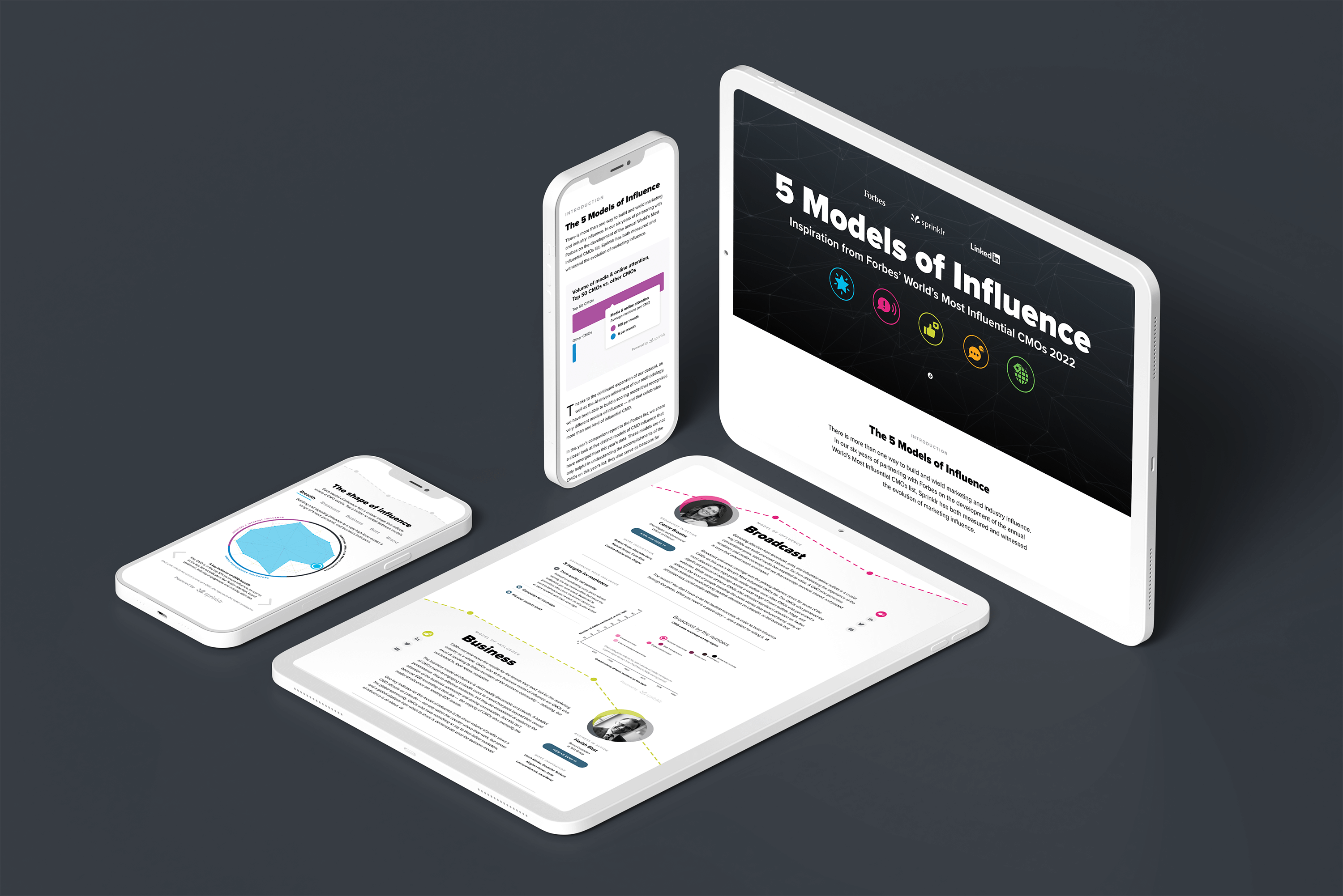
The final report was both visually engaging and easy to navigate. This edition was praised by Forbes’ data scientist as the smoothest collaboration to date, highlighting both our team's agility and clarity of process. Beyond design recognition, the project also delivered business impact, generating new customer leads for Sprinklr and reinforcing its position as a leader in marketing thought leadership.

View the Ceros Experience

This interactive report is best experienced in fullscreen. Click below to open the full experience in a new tab.

View Full Interactive Report